Universum College
E-Learning Platform Redesign
A student-centered redesign of a university e-learning platform — wireframes, prototypes, and responsive layouts shaped by real student friction.

E-Learning Platform Redesign — Universum International College.
Redesign of Universum’s e-learning platform focused on reducing navigation friction and structuring academic content around how students actually access and understand their studies.
Role: UX/UI Design
Scope: UX Audit, Information Architecture, UI Design
Goal: Minimize steps to access courses and make academic progress immediately understandable
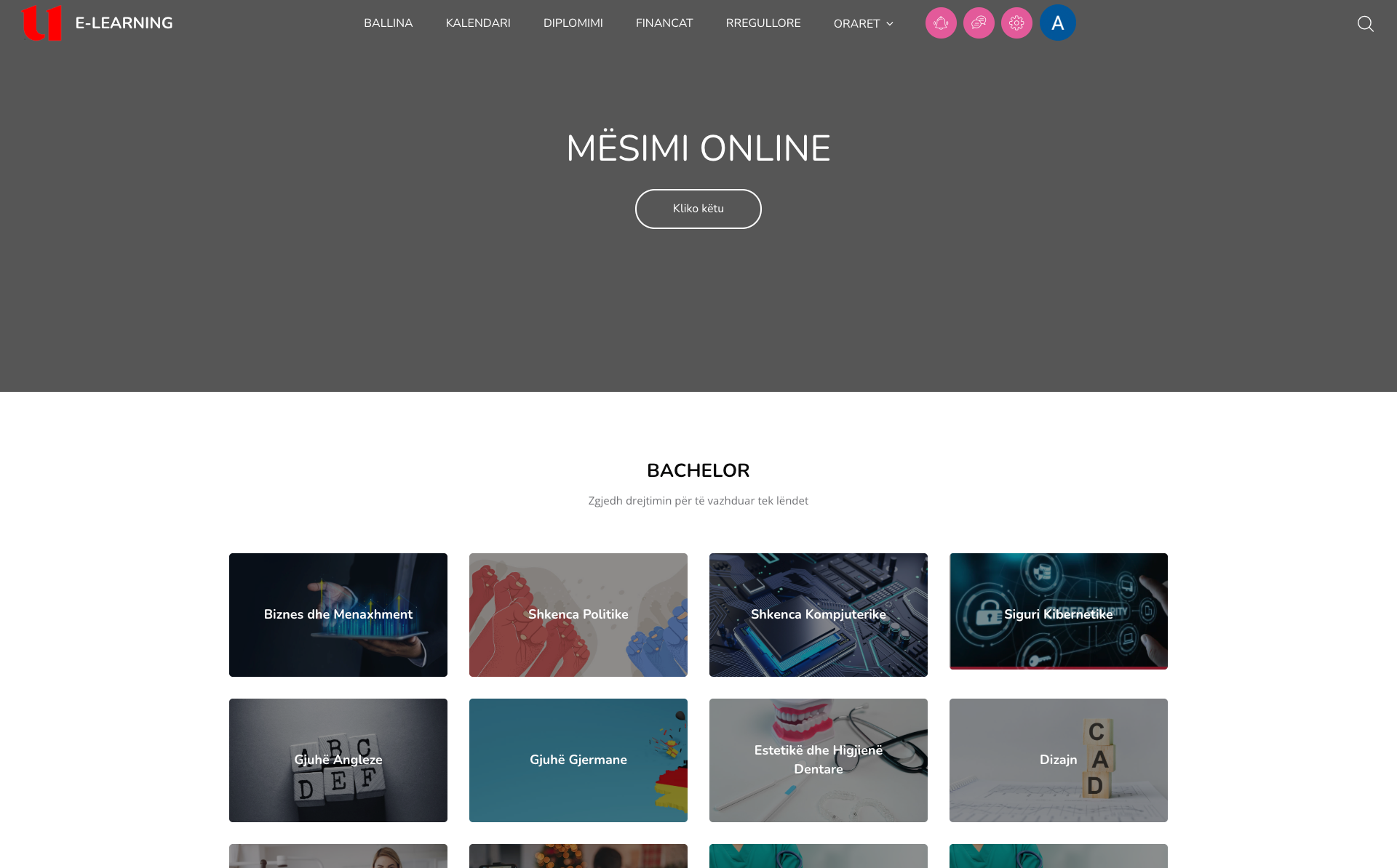
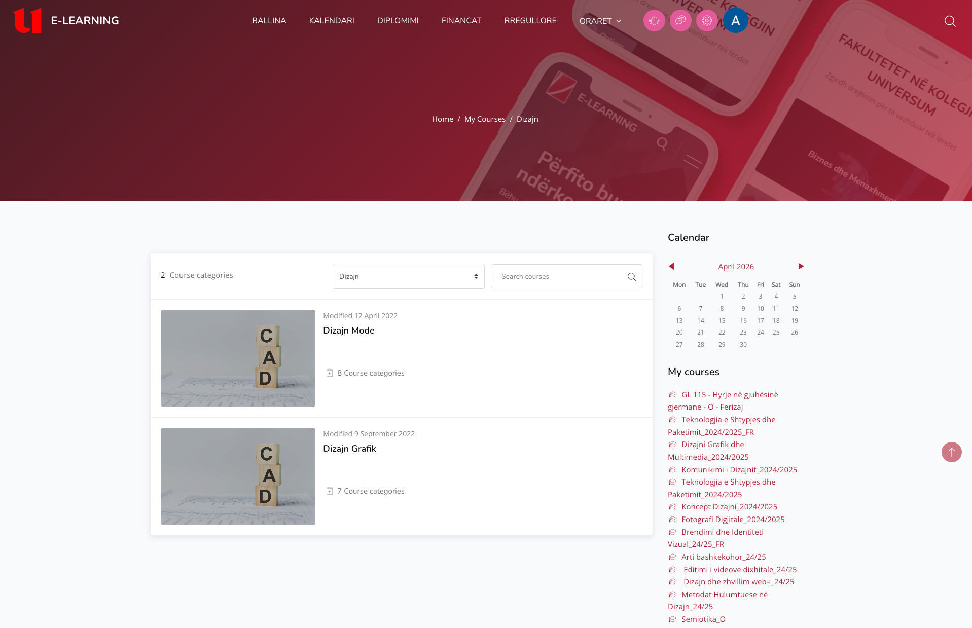
The platform was structured around system logic rather than user behavior.
Students had to navigate through multiple disconnected layers to reach basic tasks like accessing a subject or checking grades.
Key Issues
- — Course access required navigating across multiple pages
- — No clear relationship between program → year → semester → subject
- — Grades were displayed as long, unstructured lists
- — Course content lacked hierarchy and scanability
- — Program discovery was unclear and visually overwhelming
Why this matters
Core actions (open a subject, check grades) were unnecessarily complex. This increased cognitive load, time to complete tasks, and user frustration.
The redesign focused on aligning the system with the student’s mental model and reducing interaction cost.
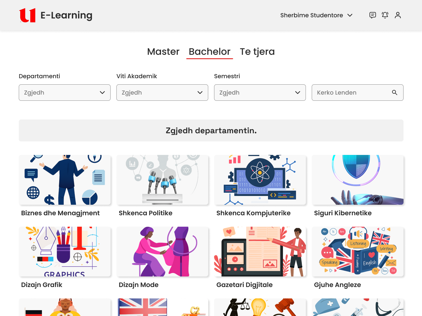
Restructuring Navigation
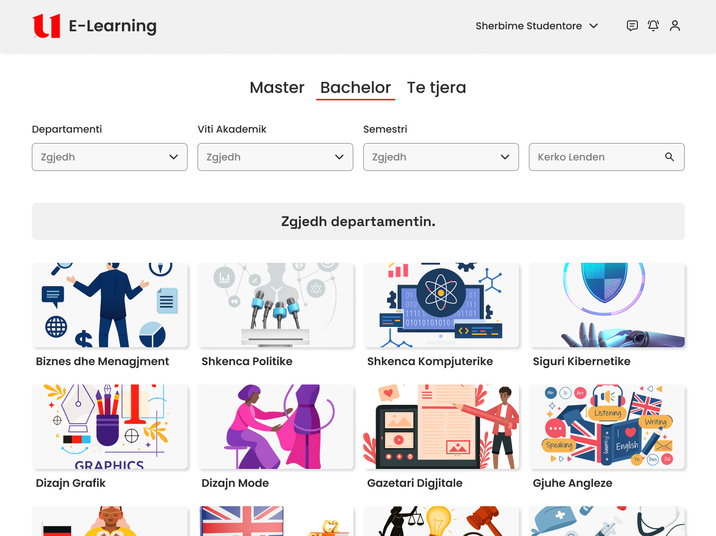
Rebuilt the platform into a clear academic flow: Explore → Choose Program → Filter → Access Subjects.
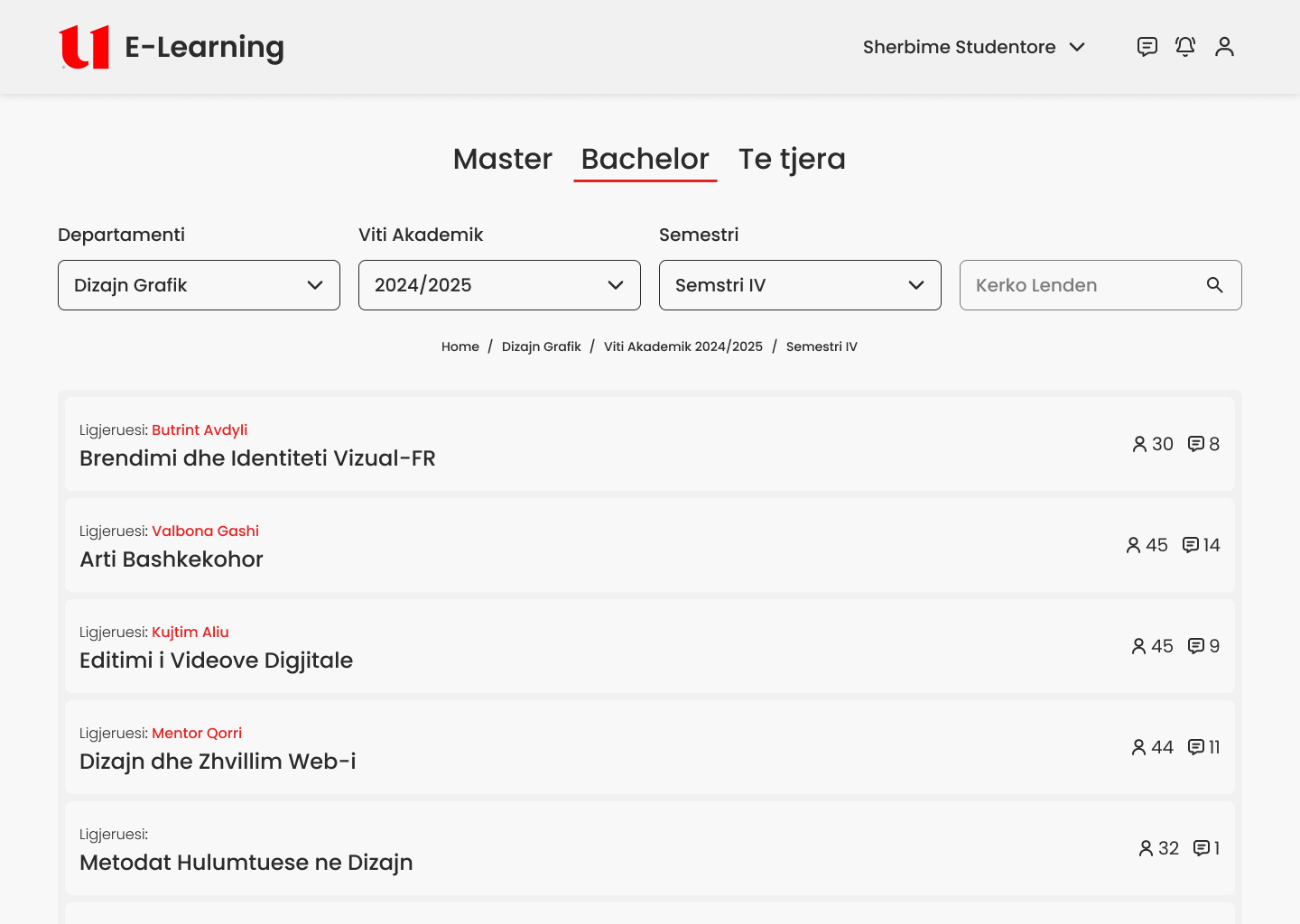
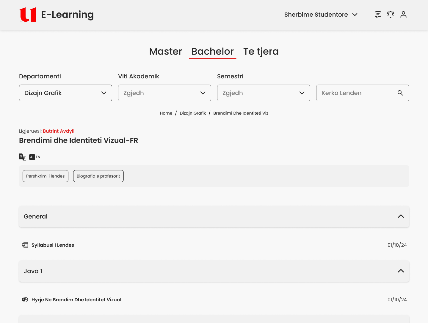
Simplifying Course Access
Courses are now accessed through filtering instead of drilling down through pages.
Structuring Course Content
Course content was reorganized into a structured, scannable format.
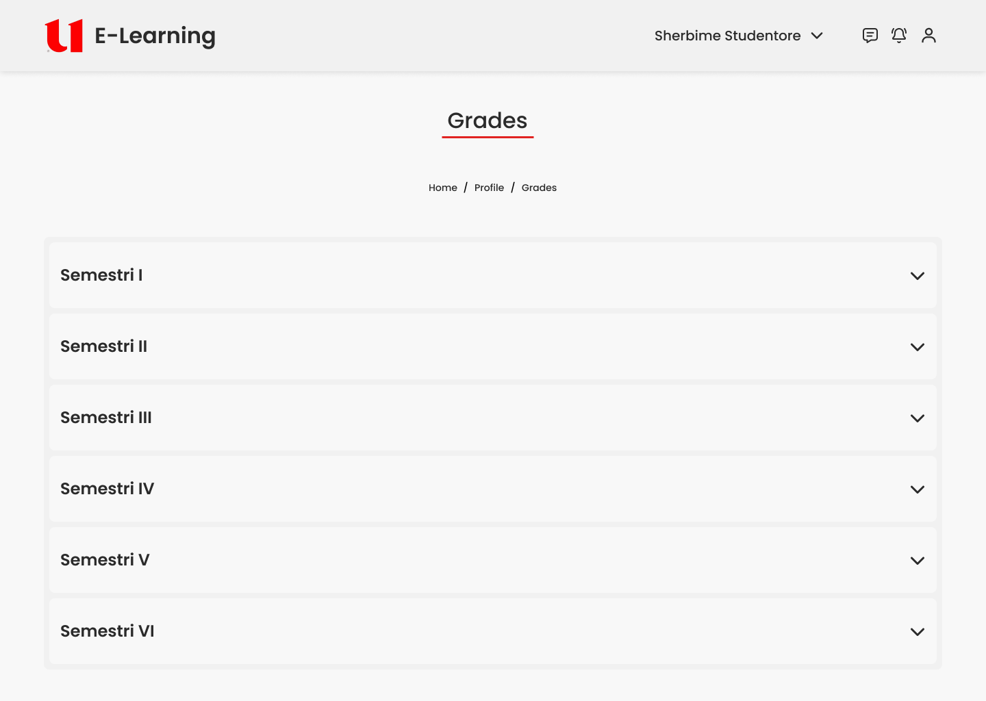
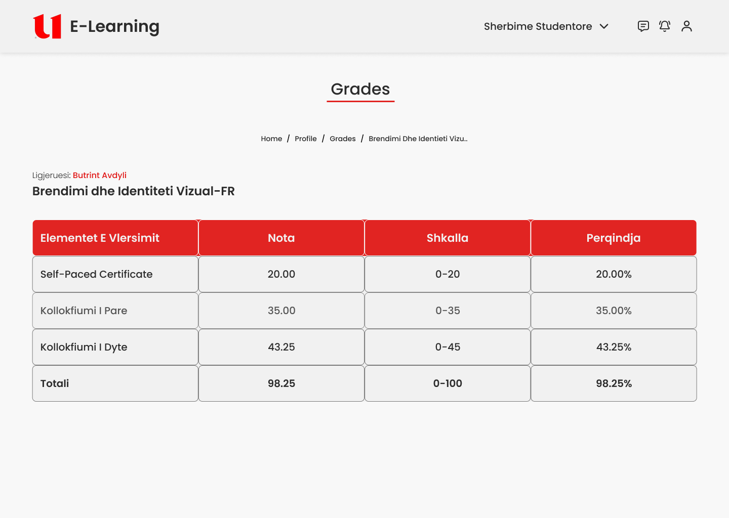
Redesigning Academic Progress (Grades)
Grades were redesigned into a hierarchical system.
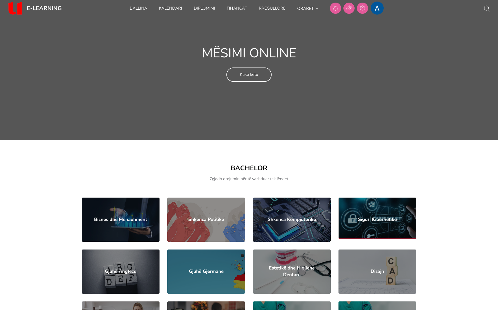
Before
- — Multi-step navigation
- — No filtering
- — Disconnected structure
After
- — Program → Filters → Subjects
- — Semester-based navigation
- — Direct access to relevant content
The redesign reduces friction across all core student tasks.
Outcomes
- — Fewer steps to access courses
- — Faster navigation across platform
- — Clear academic structure
- — Improved readability of grades
- — Reduced cognitive load
What this project demonstrates
- — Strong information architecture thinking
- — Ability to simplify complex systems
- — Focus on decision-making, not visuals
- — Designing based on user mental models