8 Pearls
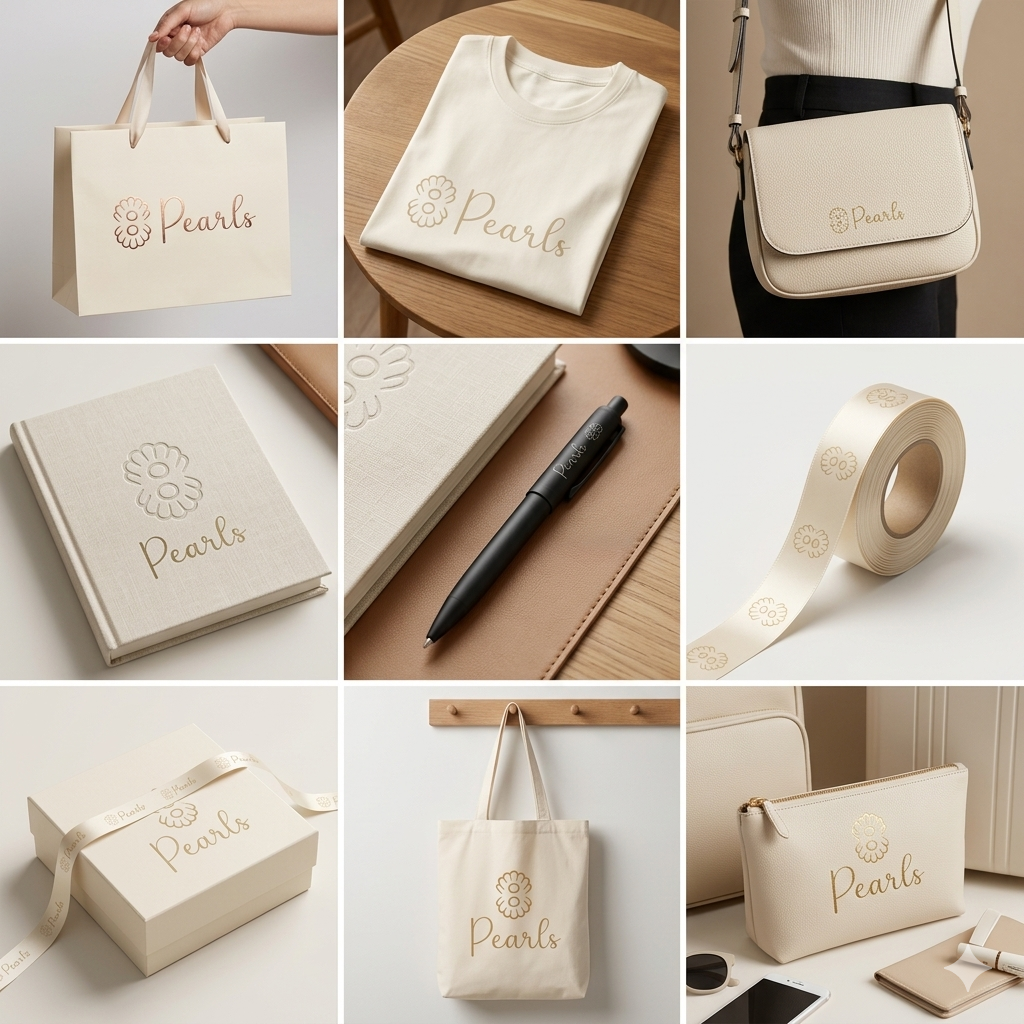
A full brand identity for a premium feminine label — a quiet mark, a tactile packaging system, and a bag program built to carry the brand.
8 Pearls is a new premium label in the feminine-care category. The brief was to design a name, a mark, and a full identity system that could scale from a business card to a storefront bag — and still feel like the same quiet, confident object at every size.
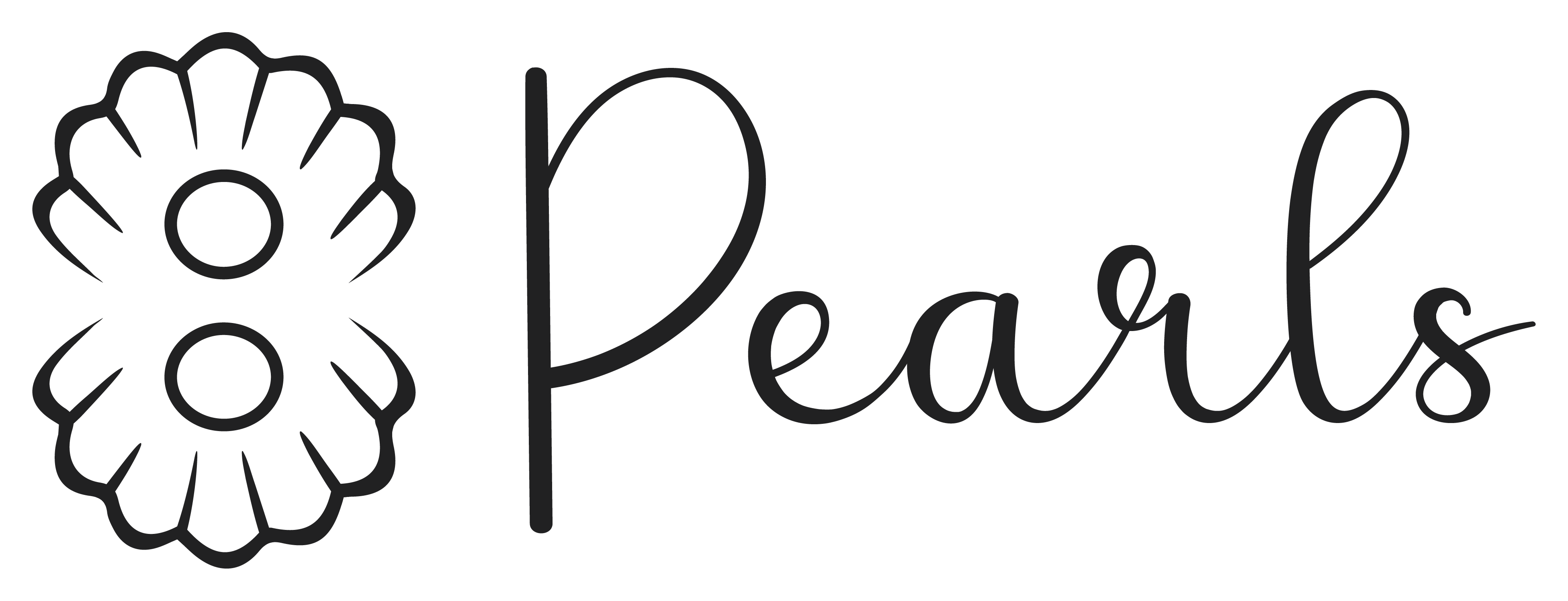
The idea behind 8 Pearls is to symbolize the presence of eight sisters, expressed through a single, unified form.
The typography is based on a clean and elegant font, chosen to ensure clarity and a timeless feel. Alongside it, a custom-designed icon was developed to add a distinctive visual element to the brand. This combination keeps the text simple and readable, while the icon carries the unique identity and personality.
The icon is a custom pearl symbol, where the number 8 is subtly integrated into the shape, forming a unique and recognizable mark that reinforces the concept behind the brand.